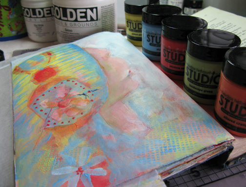
 A couple of weeks ago I purchased 6 of the 15 colors available of Claudine Hellmuth's Studio acrylic paints.
This weekend I tried them out in my visual journal which is a perfect place to try new things.
In this first picture, I have only used the Studio paints. I did use a little gesso but found the white Studio (not shown) did what I wanted the gesso to do.
The paints are very creamy which is not always a plus for me. They are all translucent and therefore will layer nicely just like watercolor. In fact I did enjoy using water with them and using them like watercolor.

As mentioned, I only purchased 6 colors. I found myself wanting a different value. I remember there was a brown and black and maybe I should have purchased those too. My intention was to use other mediums and I will.
I guess I should try them now on a canvas. Maybe I have time to do that today.
Sharon

eeeee!!! so very lovely!!! i have the helmuth paints, too. they're not my favorites, but they do come in handy. i had to get used to them after working with golden.
ReplyDeleteIsn't it exciting to try out new media and compare it with what one knows - and one is never sure how much to buy initially (at least I find that happens with me!) Thanks for introducing these.
ReplyDeleteThanks for this information. I've been wanting to try some different paints so maybe I'll give these a try.
ReplyDeletewell, they sure look pretty.
ReplyDeleteThese have a nice pastel quality to the colors. I do love the pictures you created.
ReplyDeleteSharon,
ReplyDeleteLovely pictures and great information about Claudines's paints. I haven't heard anyone talk about them yet. It will be fun to see your further explorations of them.
Kate
Your pages are terrific, Sharon. Those colors are very pretty, and as someone else said, have a pastel look to them, which I love. Thanks for sharing them! Have a great week! :)
ReplyDeleteSharon, If I keep visiting your blog, I will really get an education! You are always teaching us and this is wonderful. Thank You!! And, it's nice to know about new things such as the Studio paints...helps to decide what to spend our money on. You're the BEST!!! Pat
ReplyDeleteHi Sharon, thought of you tis weekend, hope your over your cold.
ReplyDeleteThis is good information as I often want a tranparent paint to go over printed word or music even designs I have put on tissue paper.
That was a first for me this weekend, I have some large stamps that I purchased to use with femo clay and didn't so I stamped large portions of white tissue paper so I could tear parts for background or for dresses on the women in the paintings.
The things one can do are endless if the brain clicks just right. WE all know if your don't do you don't think.
Your journal is an inspiration, I feel a little jittery lately from so much inspiration. Even my husband Richard was seeing things in the Menard's store I could make stamps out of.
Emelie
Sharon thank you for the lovely critique of the Helmuth paints. Now I regret not buying them while I was in Paducah last week. They seemed a little too thick and since painting is not something I am comfortable with I decided not to try them. Wrong decision. Beautiful piece
ReplyDeleteThanks for the info on the paints. I've been sketching quite a bit and think I'll start painting soon. I used to paint with oils years ago but this time around I'm going acrylic (and probably Golden's).
ReplyDeleteDarla
I really like the effect the new paints give the paper! I may have to look into them....since I seem to be stuck and need a new inspiration...LOL It gets me every time:)
ReplyDeleteWow. I really love what you are doing here in your journal..the colours and shapes are quite intriguing....xx
ReplyDelete