If I were to do just a fraction of what you do on paper, it would look like one big mess, I don't know how you do this. I do know one thing, it is art and it is yours. No copy cat here. Hugs, Mary
There is something about this layout that just draws me in. I don't think that it's any one thing. At first it was the colors, then the sideways image, but the more I looked...the more I saw so many other things that just called out to me. The map background...the way that you added your name in varying degrees...the writing curving around your name. It all works so well together. I love it!


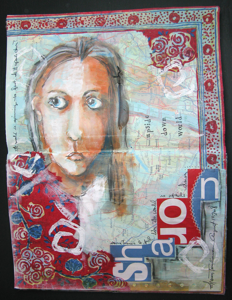

I like the map background and all the red. She's very beautiful....upside down or right side up!
ReplyDeleteVery cool idea, Sharon! As always, your work is very inspirational to me! Thanks for sharing! ~Joann
ReplyDeleteGorgeous! I am really enjoying looking at your art journal pages!
ReplyDeleteAs always your art has something to say. You are doing great things with your journal pages.
ReplyDeleteYour journal pages are even masterpieces! I love your work; every one of your subjects inspires a story in my imagination.
ReplyDeleteI really-really like her a lot! I am still working on mine.
ReplyDeleteIf I were to do just a fraction of what you do on paper, it would look like one big mess, I don't know how you do this. I do know one thing, it is art and it is yours. No copy cat here.
ReplyDeleteHugs, Mary
Such a wonderful piece
ReplyDeleteAlison
She could be from 'downunder'. Love the pages and the colour, go the red, white and blue from here too.
ReplyDeleteSharon.....I love this...the freedom in your painting is exhilarating! Love the colors and the asymmetrical balance! WOW! Great job:D
ReplyDeleteThe colors are rich and wonderful. The page does have an international feel even tho the colors are red/white/blue.
ReplyDeleteDarla
I like her very much, too. She has a nice spontaneous feel.
ReplyDeleteAlice in Wonderland is what came to me first. Probably not what you were going for, but I love it nonetheless!
ReplyDeleteThere is something about this layout that just draws me in. I don't think that it's any one thing. At first it was the colors, then the sideways image, but the more I looked...the more I saw so many other things that just called out to me. The map background...the way that you added your name in varying degrees...the writing curving around your name. It all works so well together. I love it!
ReplyDelete